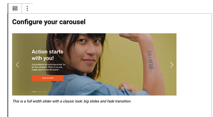
Block: Carousel Header
Purpose: This block is designed to show image and media content. We put issue/overview content with pictures of supporters, activists and the general public, reinforcing the notion that nothing can be saved or protected without people. In practical terms, an image of something happening in the world should be constantly juxtaposed with the people who are taking action and creating positive change.
Pages: Home (at top) – see page layouts and blocks
For content images the max width is 1140px. To ensure quality please supply images with a width of no less than 1140px. An ideal width would be 1440 pixels to allow for any minimal cropping – more on Image Ratio and visuals.
The Header Carousel can be swiped left for S/M sizes on both Right-to-Left and Left-to-right effects, depending on your alphabet..
This style allows a carousel spanning across the full page width using a classic look: big slides, fade transition, and no sub-headers. See all screens here.
Edit mode
Frontend rendering
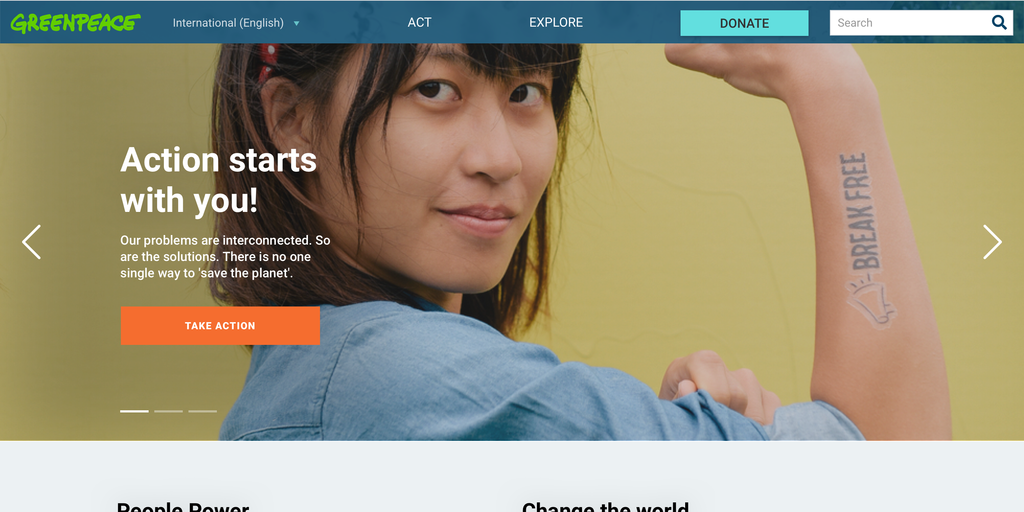
Carousel Autoplay
- Since release v.1.46 , an autoplay feature was added to this block: the carousel header auto play slides animation, which can start based on 2 triggers:
- Automatically => since release v1.48 the web editors have the option to choose if they want to auto play slides animation. A new button, which is activated by default has been added to the corresponding block.
- Manually => if users click on the right or left arrow or on the page controller.
- When the Carousel Header has only 1 slide, the arrows and the page controller should not be displayed. Also, the slides animation should not play. However, there should be no data on the next slides (2, 3, 4…), no image, header, etc. for this to work correctly. There should only be data on the first slide.
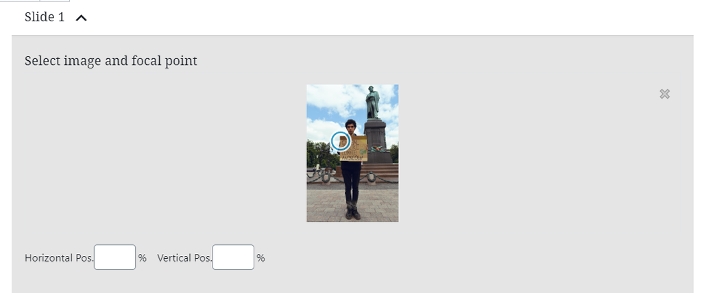
Select file image
Click on Select Image and focal point and choose one of the options available:
- Upload file OR
- Select one from the Media Library
Select focus point for image
You will see a circle with blue margins on the image. Drag and drop it on the image where you want the focus point to be OR add numbers in the Horizontal Pos. and Vertical Pos. spaces.
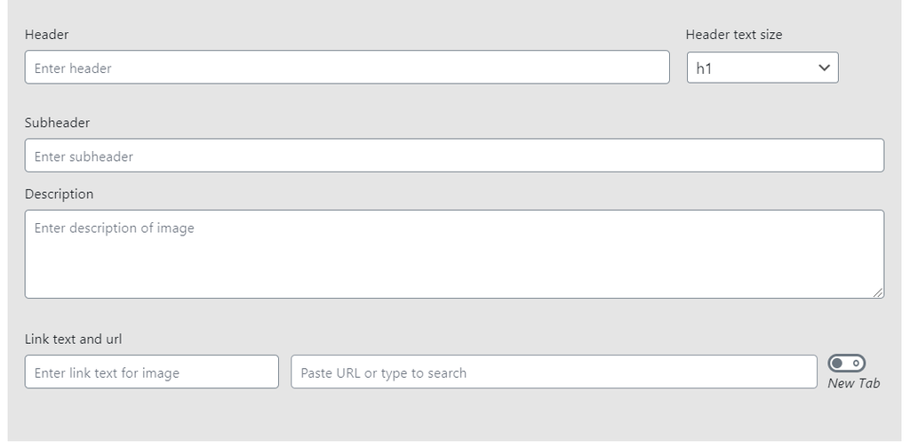
Text – Link fields
- Header and header text size
- Subheader
- Description
- Text for link
- Url for link
- “New tab” checkbox (open button link in a new tab)
Character number limitation
- Another important update brought to the carousel is that the blocks displays character number limitation on WordPress. The feature informs web editors how many characters they can type on each field. The number will update while editors are typing text.
- The header limit is 32 characters while the Description is 200 characters.
Do’s & Don’ts
Do’s:
You should use as much as possible:
- Simple & clear photos.
- Photos with main centered subject(s) or on the right hand side.
Examples:
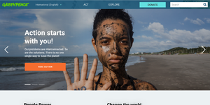
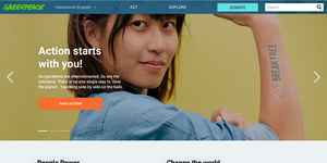
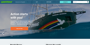
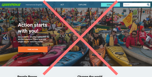
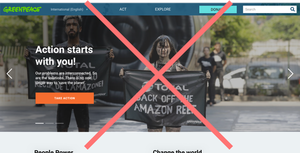
Dont’s:
To secure the text and call to action legibility, you should avoid using as much as possible:
- A photo with a subject (person, animal, object …) on the left hand side.
- A too complex photo with too many subjects (people, animals, objects …).
- A photo who already contains a text on the left hand side.
Examples:
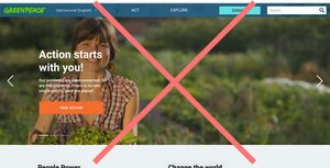
Design Elements
All design files of the block are available in the P4 Design Systems > Blocks > Carousel Header
Links & Resources
- Handbook
- Visuals (images & Videos)
- Navigation & main pages
- Page Layouts & Blocks

