Block: Gallery
Visuals are extremely impacting. Sets of images can convey a powerful message, if combined and displayed properly.
Purpose: Lay out short bits of text and accompanying photographic elements in various display modes: slider (Carousel), 3 columns or Grid.
Add the block to your page
Among the “Planet 4 Blocks” select Gallery
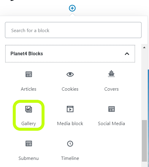
Slider style
A carousel of images relevant for the topic with arrow selectors on the sides to switch from one image to another.
Slider edit mode
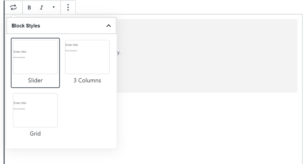
In the edit mode, you simply select the slider from the gallery styles.
You can also add a title and a description if you want, but it is not mandatory.
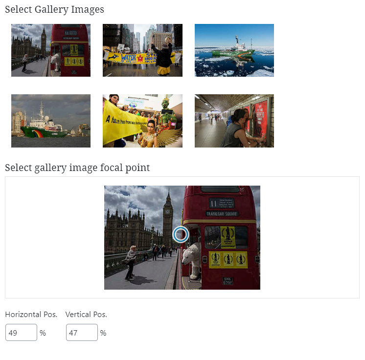
Then, the images have to be selected.
After all the images for the slider have been selected, you can next choose the image focal point. There is a circle displayed on the image, so you can simply hover over an image and select where the focal point to be.
You can easily edit and delete or add more images by going at the top of the block and clicking on the pencil.
You can also delete the block or have a series of More options where you can:
- Hide block settings
- Duplicate the block
- Insert before or after the current block another block/ paragraph/ table etc
- Edit as HTML
- Add to reusable blocks, which will basically allow you to have this block available for future use and will help you save time. And clicks
Slider front end
Below you can find an example of gallery using the sliders style.
| KEY INFOS
|
3 Column style
Use this style to combine photographic elements in three columns. Great for accentuating text and telling a visual story.
Pages: ISSUE pages, Evergreen pages
3 Column edit mode
In the edit mode, you simply select the slider from the gallery styles.
You can also add a title and a description if you want, but it is not mandatory.
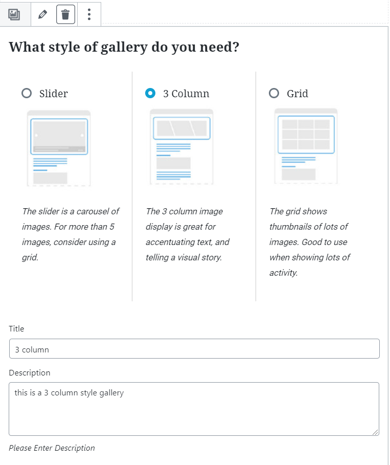
Then, the images have to be selected.
After all the images for the 3-column style have been selected, you can next choose the image focal point. There is a circle displayed on the image, so you can simply hover over an image and select where the focal point to be.
3 Column front end
Below you can find an example of gallery using the sliders style.
Grid style
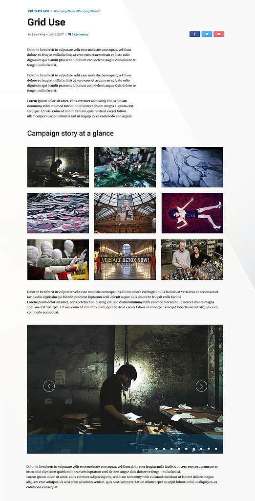
Use this style to show thumbnail of lots of images, properly aligned. Good to use for storytelling, when showing lots of activity on a particular theme.
Grids are used to give an overview at a glance, called helicoptering. For example, they can be used by a campaign to show e.g. “the story so far”, “what we achieved”, or “where we are going”.
Grid edit mode
In the edit mode, you simply select the grid from the gallery styles.
You can also add a title and a description if you want, but it is not mandatory.
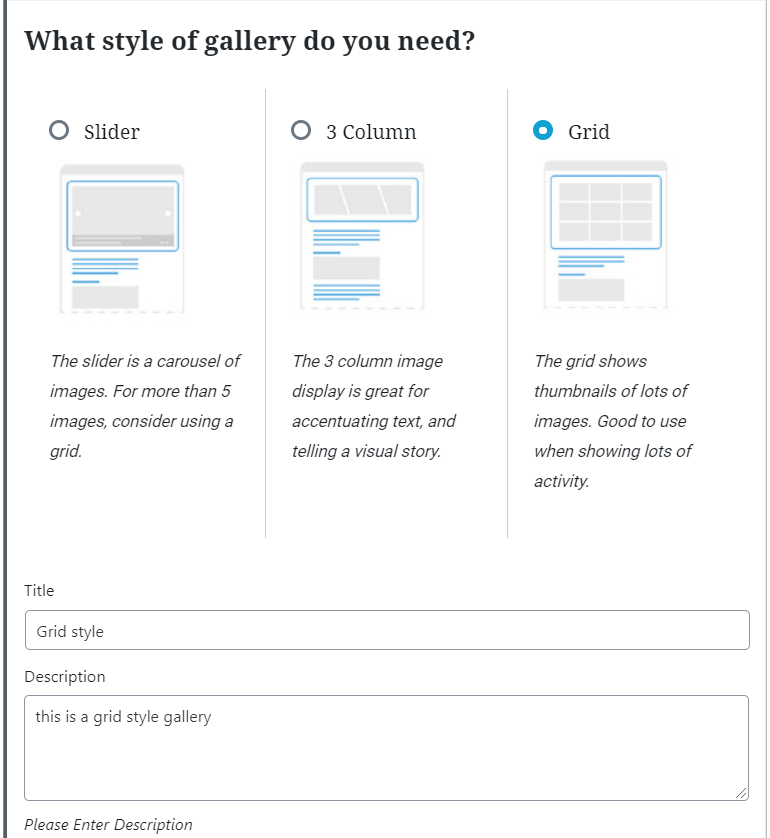
Then, the images have to be selected.
After all the images for the 3-column style have been selected, you can next choose the image focal point. There is a circle displayed on the image, so you can simply hover over an image and select where the focal point to be.
There is also a preview to help you visualize how the gallery would look like.
Grid front end
Block styles – Campaigns
KEY INFO – Each Campaign has its own Gallery Slider style. The other styles (Grid / 3 Column) are the default ones.
Please check out the Design Systems to see the Gallery slider style of each campaign
Design Elements
All design files of the block are available in the P4 Design Systems > Blocks > Galley
