Set up and manage your Usabilla account (feedback, campaigns, pop-ups..)
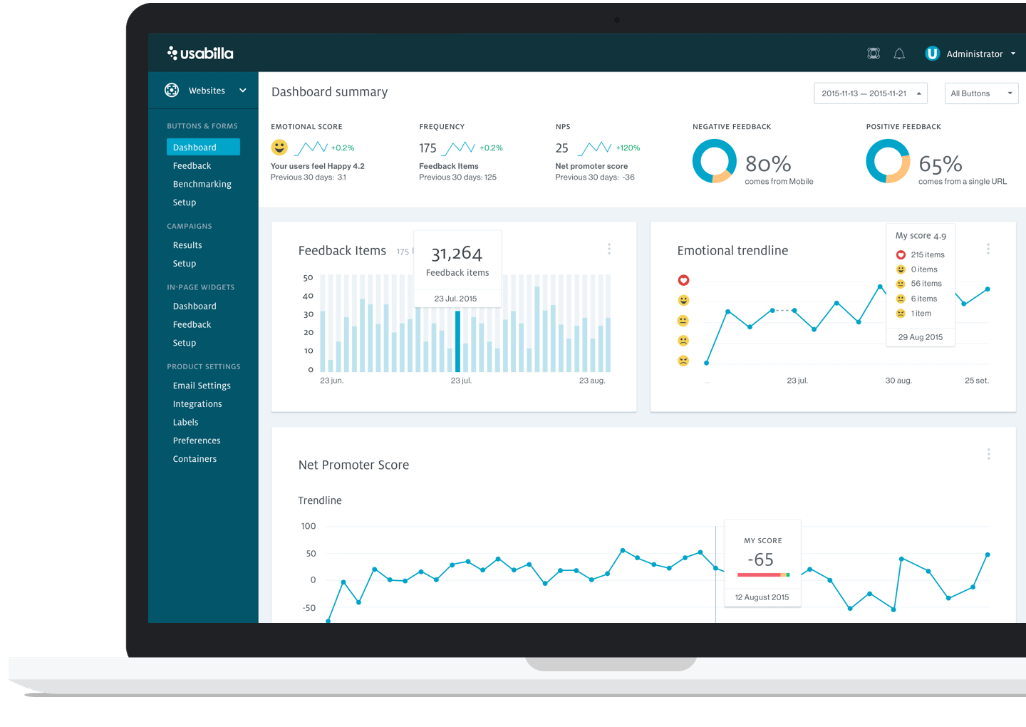
Usabilla is part of the UX stack and is mainly used to gather feedback and improve the experience in P4. It also offers tools to better understand our audiences and/or to drive people to action.
Usabila is not the global tool for managing feedback, campaigns and pop-ups for the Planet4 project anymore. In January 2020, Usabila has been replaced by Hotjar as the global tool to analytics & feedback that gather quantitative & qualitative data.
Install Usabilla
Usabilla is a 3rd party tool, and the connection with your P4 site is made via Google Tag Manager, with a javascript Tag.
[Check here the instructions on how to install the button]
If you don’t have access to Usabilla, please contact the Planet 4 Team to create and set up your account.

What Usabilla does (video)
Click here on on the image below to watch a demo by Nikos, from Usabila.
Access and manage your account
We have a global Greenpeace Usabilla account, for all the “Feedback” buttons. The P4 team will support you in creating your buttons and giving you access to the proper ones.
Once the P4 site is live with a Feedback button, you can login at http://app.usabilla.com/ (to get your account, contact the P4 team), where you can analyse what your users think about your P4 site.

Workflow & roles
If you are just starting with Usabilla or want to improve the way your office is working with the tool it’s important to define a workflow and assign roles. This will help you to better manage your account, collaborate efficiently with your team, setup plans and extract valuable insights.
Here’s what you should be doing to properly manage your account:
- Start by choosing a Usabilla owner: This will be the go-to expert at your office! This person should also be responsible for keeping the account organized.
- Engage your stakeholders: Explain how Usabilla can make their life easier and help the team to reach its goals.
- Define your goals: What do you want to achieve this year?
- Define your KPIs.
- Assign roles and define a possible process.
- Check current applications and integrations with those applications. Find out what they can do for you!
- Set up labelling and filters to manage feedback streams.
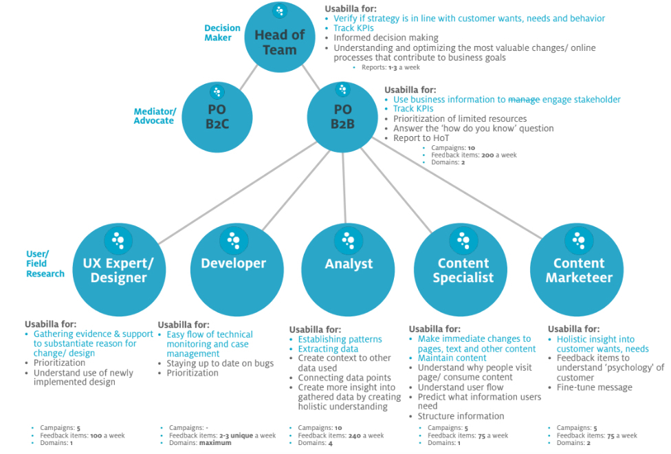
Take a look at the diagram below and find out how your team could be interacting with the tool:
Tips to manage your account
- Use filters & exports: set them up and automate the process per stakeholders
- Enable team for detailed analysis: plan weekly calendar event for stakeholders to zoom in on (special) feedback items. Report to each other what you’ve found
- Make user feedback an agenda point: share it daily/ weekly during the standup or dedicated meetings. Share the most interesting information with the full team •
- Implement: Give each stakeholder the time and resources to implement. Find out who needs to talk to who
- Monitor the overall process: Share how all the stakeholders using Usabilla, together have created better results. Use concrete examples
- Repeat and evaluate: make weekly, monthly and quarterly reports. Actively involve CMS in achieving your business goals. Be critical of the product, process and wishes, and notify CMS early with a question
Feedback buttons (passive feedback)
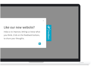
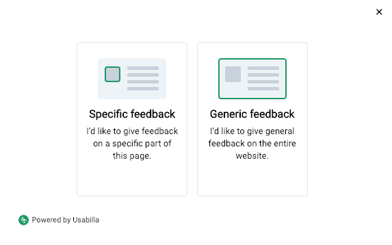
Also referred to as passive feedback, a feedback button is a sticky (or floating) button on the screen. Using this tool, visitors can either point out specific areas in a page to give feedback to by highlighting and screen-shooting it (specific feedback) or give generic feedback to the entire page.
These buttons are great tools to collect:
- Key actionable Insights
- Emotional Rating: Understand the overall emotional mood of your users in your website
- Capture Bugs: Identify technical problems immediately with the help from your users
- Deep-dive into sudden spikes in an analytics
- URL performance: Low mood rating can indicate problems in a particular page
Define your goals
What do you want to achieve? Greenpeace International, for example, is using Usabilla Feedback Button to enable users to provide qualitative feedback on each page of the P4 website, facilitate bug reporting, integrate user stories and facilitate population of backlog (JIRA).
Create your forms
- Go to your setup page and edit the feedback form:
Make sure you are using the same questions to Desktop and Mobile buttons.
- Create your feedback form: select language, type of visual feedback and the elements you want to use.
You can also use a dropdown field as a condition for new questions: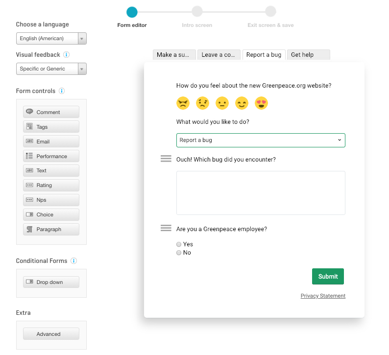
- Edit the elements to define field name, empty value and auto labels:
Please, follow the international labelling system.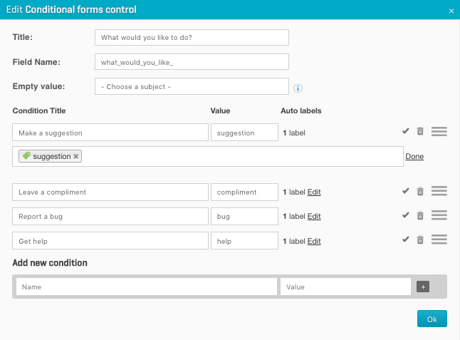
- On the next steps, you can also edit your intro screen and your exit screen. Don’t forget to write a nice thank you message to your supporters.
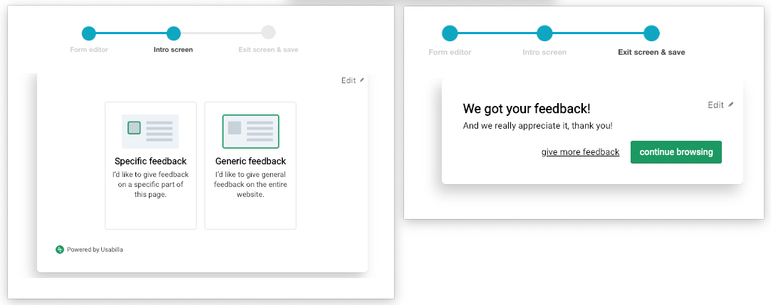
- You can also go back to the setup page and add a custom form. This could be used for a specific feedback form or a version in a second language.

- Don’t forget to define the targeting conditions of the custom form:
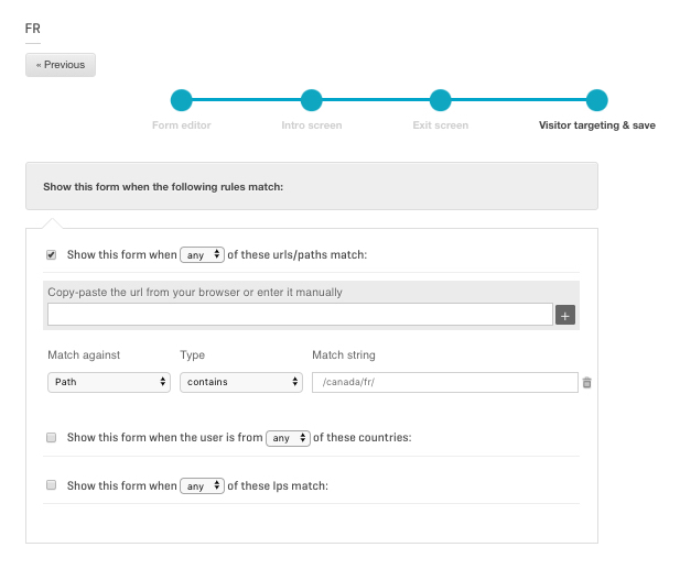
Improve your forms
- Enhance your toolkit with our integrations
- Auto-labelling: categorise your feedback so you can quickly identify which feedback is relevant
- Set automated emails: You can notify the appropriate staff or team responsible for bugs, compliments, checkout issues etc.
- Case management: make sure your colleague sees a crucial piece of feedback & assign it a priority
- Public API: push all Usabilla data to your custom dashboards
- Key Insights: have a clear overview on the key insights regarding anomalies.
Organize and Label feedback
Organizing feedback into categories right away (suggestion, compliment, bug) makes processing and sorting smoother, allowing the P4 team to focus on consolidation and turn feedback into reports and stories to further explore. Since the last field allows generic text, we may use text-analysis tools to go through data and then draw patterns from what users are telling us.
Feedback should always be labeled. Once a piece of feedback has been processed, it is archived in Usabilla. This helps to keep the dashboard clean and allow new inputs to come in.
But remember you should not remove labels before moving feedback to the archive.
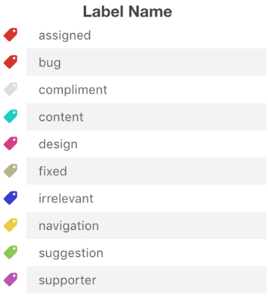
It depends on the label and type of feedback. Below are the current labels and what each means:
- Assigned: The feedback has been passed on to the appropriate team. Most often, this is sent to the Communication and Storytelling team. However, it has also been used for feedback that is sent to the Legal Team or the Global Mapping Hub. This label is NOT for feedback that goes to any Planet 4 team.
- Bug: The feedback is in the Planet 4 JIRA system filed as a ticket. This means that the Planet 4 development team has been notified of the feedback, and the team will prioritize in their sprints.
- Compliment: It is nice to receive compliments, but we archive them right away. When we archive them, we put “<3 The text from the complement <3″ into RocketChat to share with the entire team.
- Content: The content label is used to separate out feedback that is specifically about GPI content choices. These pieces of feedback do not require development or design, but rather a thoughtful approach to content. They are given to the GPI Content Team for their thoughts, changes and inquiries. Check the spreadsheet where content feedback is assigned.
- Design: Feedback items labeled with design are compiled each week for the P4 Design Team. Once feedback has been compiled, it is marked as archived.
- Fixed: If a user points out something we’ve already fixed, the feedback item gets this label. Occasionally, we’ve fixed something but not yet pushed to production.
- Irrelevant: this label includes opinions from users that have previously been discussed and decided, or those that go against data, are marked with this label to indicate that we’ve already talked about the suggestion or bug, and chosen to go a different way. This tag is also used for feedback that we cannot reproduce (e.g. when a user says something doesn’t work, and it works as intended) or feedback that does not make sense.
- Navigation: Since navigation is one of the most difficult challenges we had with this site, we wanted to be able to quickly filter thoughts about navigation. Whenever the user gives feedback about navigation, we mark it with this label.
- Suggestion: This label is most often used as self-selected by users. Most often a label of bug or design or content will be used to highlight where the suggestion belongs. We leave this label for suggestions that are either already on the roadmap (e.g. part of the concept) or stuff we never thought of.
- Supporter: When the feedback is obviously not staff, we are adding this label.
Organize feedback (Video)
Campaigns (active feedback)
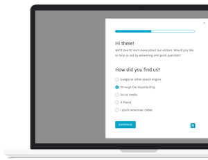
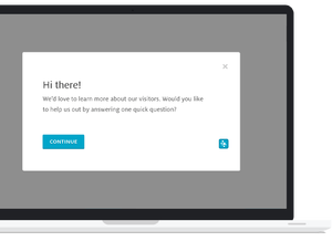
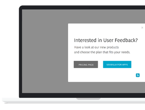
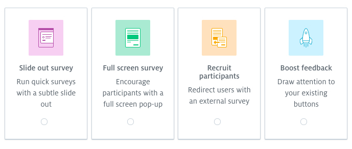
Usabilla refers to “campaigns” as tools to actively ask visitors for feedback. This feature offers great engagement potentials, allowing targeting pop-up campaigns to ask specific questions (e.g. Survey) or for Call To Action (e.g. Slide-out CTA)
Plan your Usabilla Campaign
- What is the goal of the campaign?
Collect insights into web page usability - What kind of question do I want to ask?
Generic Page Rating - Where should it be placed?
All over the website | Target based on page visited or time
- In the form of…
Passive feedback form - How do I word this question?
‘What is your opinion of this page?’; answer option varies, but you can use a 1-5 scale, smileys or stars
- Appropriate follow up question(s)
Ask visitor to select a category (e.g. bug, suggestion, content, compliment, other) to get an idea of what they think of the page, or you can also add an open text field at the bottom
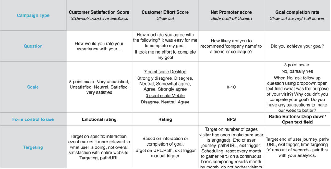
Usabilla campaign types
>> Slide out survey
- NPS – Net Promoter Score
- CES – Customer Effort Score- How easy was it for a user to achieve their goal
- User experience: Understand if the content on the page is useful
- Manage expectations: Letting users know that certain features are
- unavailable
- Notifications- 404-error, broken feature? Use this type of survey to notify your users
- Subscriptions- win marketing leads, ask your users to subscrie
>> Full-Screen Survey
- Petition Signup or Donation abandonment
- End of user journey- NPS, subscribe to Newsletter
- Exit Surveys
- Gather answers to urgent questions (more intrusive)
- GCR-Goal completion rat
- Collect feedback from visitors when leaving their beta site
- Goal: Increase email newsletter subscriptions
- Using (NPS) promotors to raise Awareness on social media
>> Recruit participants
- A/B testing- redirect them to beta version/ legacy version
- User Research- extensive user research. Lengthly surveys should be asked using this campaign- higher conversions.
- Promotions- guide your users to certain promotions on your website by using the redirect URL.
- Redirect your users to help pages/release notes etc.
- Drive traffic and bring awareness to current campaign.
- Find out why visitors are on the website and if they have achieved their goal
- Understand who is visiting their website for better UX
>> Boost Feedback
- Feature release- collect feedback on this particular feature (screen shots)
- A/B testing
- Spike in analytics- use this survey to gather qualitative feedback to enrich your quantitative data
- Let your users know you are listening to them, let them know you are user centric
- Increase the amount of feedback being received on the website
Targeting options
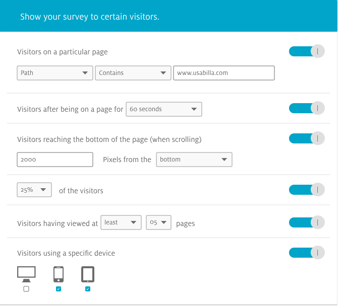
- URL/Path targeting: This option enables you to intelligently target your user based on their user journey. (i.e. notifications: notify your users on stock, errors, promotions)
- After a delay of X seconds: (where X is a number you set): Perfect example of pairing quantitative with qualitative data. Look into your analytics see where users spend the most time & deploy a campaign. (i.e. run a survey when users take to long to signup on a campaign page)
- When a user is about to abandon the page on a desktop device: This option allows you to trigger a campaign (survey) when a user is about to leave your page via mouse-out movement (i.e. investigate drop off rates on your exit pages or when leaving a page without taking any action)
- When user scrolls halfway down the page: This option allows you to target engaged users who have scrolled through your content or search pages. Target on pixels from top or bottom, great for meta-search research.
- Manual triggers: JavaScript triggers are lines of code which you add to your site in order to trigger a campaign based off a specific user action, i.e. clicking on the CTA/ switching between beta and legacy version for A/B testing
- Custom Javascript Value (custom variables): By targeting on custom Id’s you can personalise the campaign, i.e. premium users. Any custom ids you collect on your users can be targeted with campaigns. Personalisation
Schedule your campaign
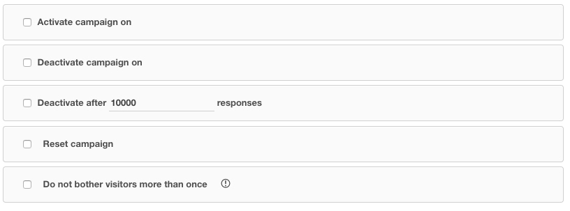
You can schedule your campaign to start or end in a specific date, after a specific number of responses and also not to bother users more than once!
Campaign takeaways
- Decide what you want to know/ask
- Be specific
- Keep it simple
- Don’t make assumptions
- Ask what your users are doing now, not in previous or upcoming visits.
- Ask for insights, not known analytics.
- Keep a logical order in the questions.
- Only ask what’s needed/what’s going to be used
Examples of Usabilla Campaigns
Check more examples in this document (Internal Use Only)
Usabilla Integrations
- Analytics: Know the why behind what’s happening (Google Analytics)
- Project management: Automatically push feedback to the right channels (Slack, Zendesk)
- Data management platform: Send through other data points from your data layer <> (Google Tag Manager)
- A/B testing: Combine your quantitative data with qualitative insights and understand the reasons why some of the variants could be working best (Google Optmize)
- Session recording: Make sense of user behaviour (Hotjar)
- API: Takes things one step further
Links, Resources & Contacts
- For any questions, you can also get in touch directly with [email protected] or check the resources below:
- Internal use

